Category: Samples
-

Sophos – Cyber Security
Boy, those viruses, huh? They’re everywhere, trying to wreck our lives. Luckily Sophos is there to scan and sweep them away. From our computers, at least. This was a fun, quick job that needed a very specific tone in order to convey the sense of dystopian angst- the directors sent references that were very film…
-

Love, Depicted
I’ll leave out the specifics on what product/company these frames were advertising for; suffice to say, it was a collection of short spots of families and loved ones reflecting on the nature of their relationships (with some product placement tastefully featured in the periphery). Rather, Let’s consider these boards an example of how I really…
-
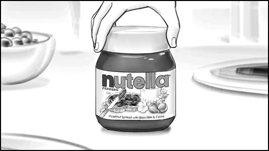
Nutella “Spread the Happiness” Storyboards
Woohoo! In addition to the previous Nutella spot, I happened to do the boards for the most recent follow up- “Spread the Happiness!” Once again produced by my great clients at Brand New School. They are playing this spot a LOT on TV right now- which is great, since it rocks! It’s fun, it’s pop, it’s…
-

Pine Sol Storyboards – “Powerful Clean, Lemony Fresh”
Here’s a fun spot I worked on earlier this year for my great clients at Mirada. It’s a charming commercial fo r lemon-scent Pine Sol, and to provide a brief backstory: the agency had “tested” a wacky concept of small soldiers and ballerinas chanting “powerful clean” and “lemony fresh” as they jumped into a Pine…
-

“Date Night” Storyboards
Here’s a quick sweet little project I boarded a while back – one of those synergistic multi-product subtle mega-mercials masquerading as a network PSA – tips for a fun “date night!” Here, a couple starts out there morning routine as usual- but then in a moment of whimsy, it strikes them to spice things up…
-
Duracell – Pitch Storyboards
Here’s one I’ve had on ice a while now- an old pitch, that we didn’t get awarded, and thus I’ve not really been able to present, but enough time has passed that we can risk a look at my work, and hope nobody minds. It was a rare “throw your best efforts and time…